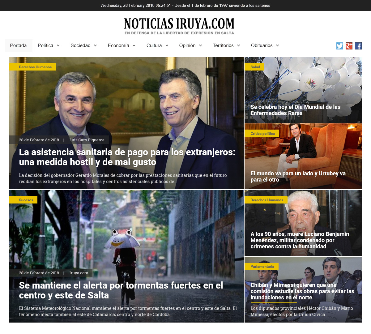
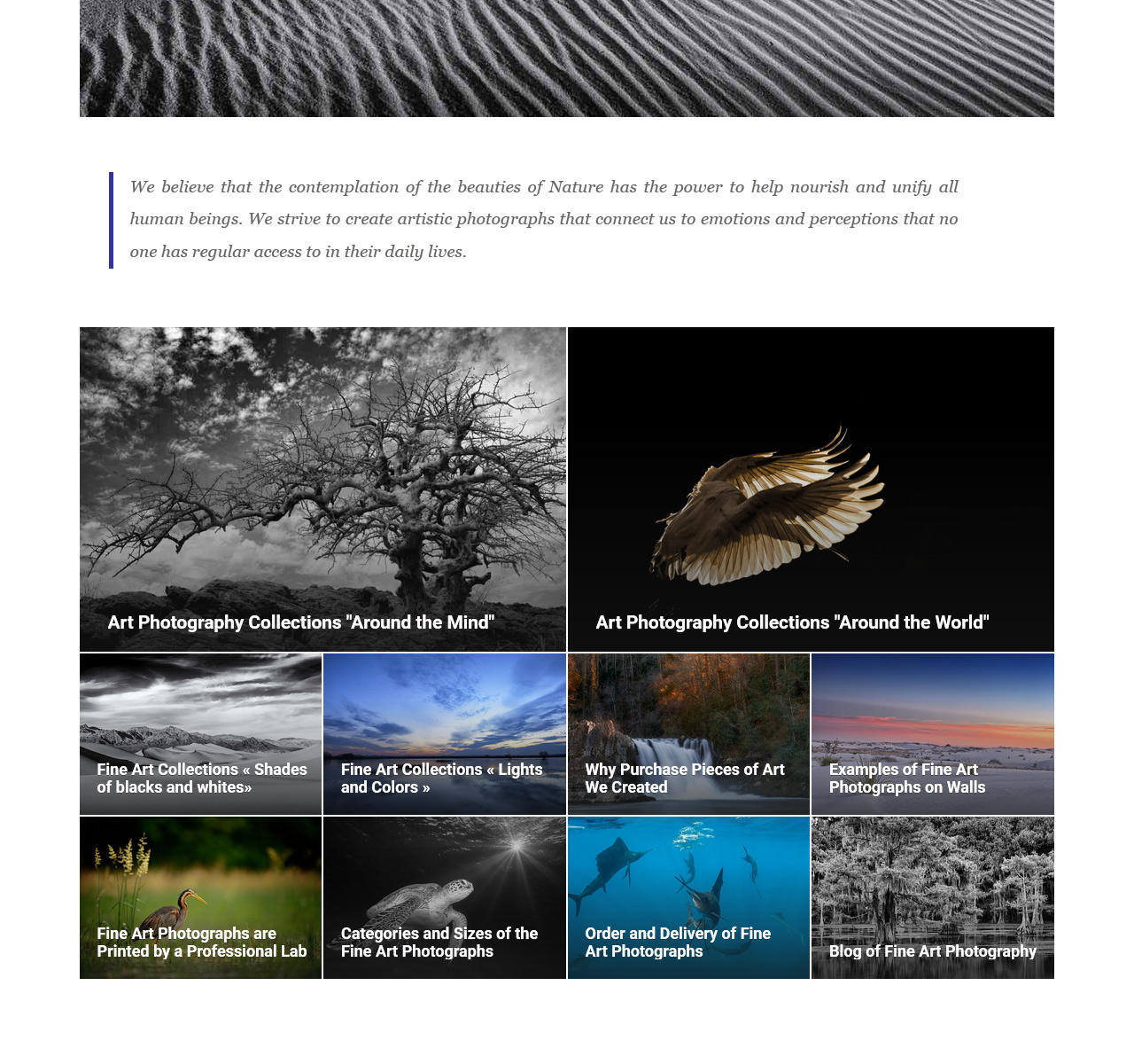
RAXO Prime is an ideal solution for the header of your Joomla site. Displaying big, bold images with titles and text elegantly overlaid is a proven way to grab attention and promote your articles. It’s a huge trend these days that delivers nice and beautiful visuals to viewers and tell instant stories what your article or news is about.
Powered by smart container queries and modern CSS grid techniques, this highly adaptable layout is perfect for magazines, newspapers, review sites and blogs that produce visually appealing content. Whatever your focus — food, fitness, lifestyle, art, law or beauty — RAXO Prime can be embedded seamlessly into any page section, from a grand header to a compact sidebar.
Prime Layout Screenshots


Prime Layout Highlights
Smart Container Queries
Unlike rigid traditional designs, RAXO Prime dynamically adapts to the actual space it occupies. Powered by modern CSS Grid and Container Queries, it perfectly aligns your content without any gaps, whether placed in a wide content area or a narrow sidebar.

Flawless Readability
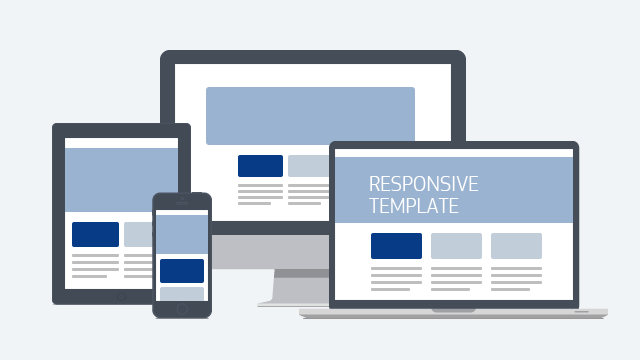
Crafted with a strong emphasis on user experience, this layout ensures your content always takes center stage. From massive desktop monitors to the smallest smartphones, your readers will enjoy a flawless, visually stunning experience without compromising on readability.
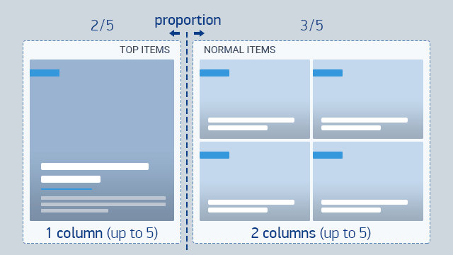
Limitless Layout Variations
Why settle for a single look? With RAXO Prime, you have dozens of layouts packed into one. Effortlessly change the proportions between top and normal items, and adjust column counts for any device, creating a truly unique presentation.
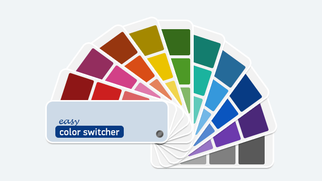
Unified Color Management
Match your site’s aesthetic in seconds. Choose from a curated selection of beautifully crafted, built-in color presets with seamless dark mode support. These trendy palettes are designed to make your content pop while maintaining a professional, cohesive look.
Prime Layout Features
- Modern Compact View: Maximize your screen space with advanced CSS overlay techniques. All text and elements are elegantly stacked on top of the image, delivering a rich, immersive experience without clutter.
- Always Readable Text: Enjoy perfectly legible titles and descriptions over any picture. Thanks to a smart darkening effect combining an image gradient and subtle text shadow, your content pops effortlessly.
- Powered by CSS Grid & Container Queries: Say goodbye to rigid designs. The layout dynamically adapts to its exact container size—not just the screen—ensuring perfect alignment in any module position.
- Limitless Layout Variations: Take full control of your presentation. Easily adjust the ratio between the top and normal sections, and set the number of columns independently for different width breakpoints.
- Predefined Color Palette: Match your brand in a click. Choose from beautifully crafted, ready-to-use color presets that utilize a modern design system for a cohesive and trendy look.
- Native Dark Mode Integration: Flawlessly integrates with dark-themed websites. The layout automatically adapts its color scheme and subtly dims images to protect your readers' eyes from bright glare.
- Crisp, High-Quality Visuals: Treat your visitors to stunning imagery. The layout is optimized for high-definition displays, ensuring your photos and clean vector icons look razor-sharp on every screen.
- Distinct Hover Animations: Engage your audience with interactive elements. Smooth, refined mouse hover effects bring your content to life and encourage higher click-through rates.
- Total Content Field Flexibility: Show only what matters to you. Easily toggle elements like titles, text, author, date, and more to create the perfect information sets for your readers.
- Plug & Play Readiness: No coding or CSS knowledge required! Simply install through the Joomla interface and seamlessly run multiple independent copies on the same page or across your site.
- Clean, Semantic Code: Built with performance and SEO in mind. Our modern, well-commented code structure follows the best web practices, confirming everything is done right under the hood.
Buy RAXO Prime Layout — $14.95
Completely RemasteredEnhance your RAXO module with an additional powerful layout and save time on manual coding. This small addition will make a huge difference to how your visitors see your content.