Today's web users want web pages to be increasingly more interactive. From this point of view, we created our new layout RAXO Grid which allows users to change views. This ability gives your site visitors a more immersive experience and allows them to consume information easily and fast, either with a quick gallery view, or a detailed summary view.
Grid Layout Screenshots

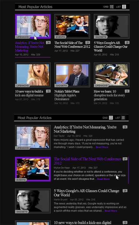
Multiple module copies on the same page
Perfectly suits light and dark sites
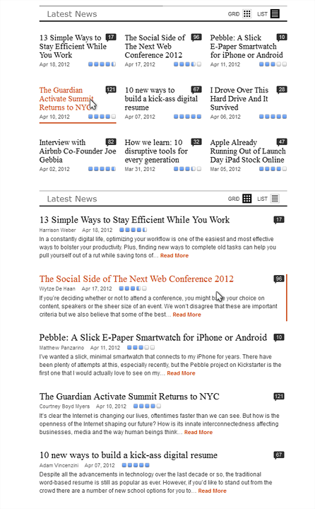
Your news looks great with just text info
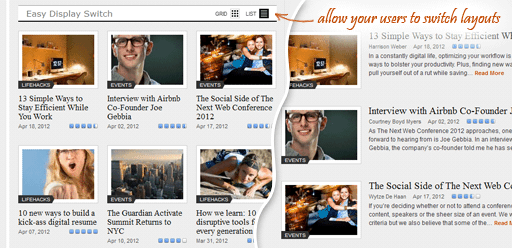
Two ready-to-use views in one layout
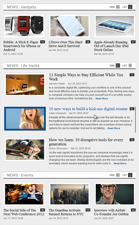
The template has two really cool views that you can switch between at any time - from compact (grid) to extended (list) view. Grid view represents information in some kind of a gallery format which is compact and easy to navigate. List view reveals more details to your site visitors without the necessity to leave the current page.
RAXO Grid layout has a powerful combination of useful features that makes it extremely functional and valuable. Please, read this blog post to get an accurate and deep understanding of how it works and how helpful it can be for your site.
Watch this short video to see how it works.
Watch this short video to see the fresh look of RAXO Grid layout in action:
- Seamless Switching: Experience the smooth, fluid transition between Grid and List views.
- Interactive Hover Effects: Watch how the articles respond to the cursor with refined hover animations.
- Adaptive Layout: See the flexible behavior of the layout as it perfectly adjusts to the module position width, automatically optimizing the number of columns for any screen size.
Grid Layout Features
- High-standard design with optimal readability of content.
- There are two ready-to-use views in one layout.
- It remembers the visitor's preferred view using cookies.
- You can set the view by default (grid or list).
- Responsive behaviour that perfectly adjusts to any screen size, ensuring an optimal viewing experience.
- Flexible when enabling/disabling fields like author, date, comments, etc.
- Smoothly transition between views with a fade effect.
- Number of HTTP requests is minimized due to Data URL usage
- There are 12 colour schemes ready for you to choose from.
- Clear SVG icons that look good in both light and dark colour modes.
- Supports multiple layout copies on the same webpage.
Buy RAXO Grid Layout — $14.95
Completely RemasteredEnhance your RAXO module with an additional powerful layout and save time on manual coding. This small addition will make a huge difference to how your visitors see your content.